Trauma cuts through lives, tearing them apart and leaving individuals struggling to put the pieces back together. For Washington-based artist Adrienne Gaither, recovery from trauma is like art: both are “time based processes.” Her latest collection and first solo exhibition, How I Got Over, visualizes her journey toward recovery in a series of geometric paintings and craggy paper collages, and will remain on display at the Transformer Gallery until Feb. 24.
How I Got Over is Gaither’s second introspective work. The first was Levels, a 2016 site-specific installation of an explorative set of objects from Gaither’s own home: African masks, books, and post-its bearing motivational messages. This level of warmth, comfort, and humanity does not appear in How I Got Over.
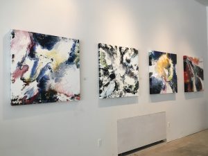
Gaither’s paintings are bold. The untextured, bright polygons end in sharp, precise edges. The painted shapes dominate each canvas and violently compete for attention. In the sub-collection Remembrance & Mourning, each image is a battleground, a freeze-frame action shot.
The shapes are layered, and the naturally recessive blues and whites are often pushed to the background while oranges, yellows, and blood-reds slice through the foreground. In “Kill Shots,” a jagged bolt of yellow traverses the nearly 5-foot tall canvas like lighting, slashing through jewel-toned blocks of red and blue and flooding the lower half of the canvas with gold. Likewise, trauma thunderously strikes and slashes a once-peaceful world, demanding unbroken attention.
The shapes, like fragmented shards of glass, divide and interlock. The paintings are mosaics built from the ruins. Gaither’s pieces evoke a step on the journey to peace. They are like a life coming together again.
The shapeshifting cycle from destruction to creation permeates nearly all of Gaither’s work, each collection showcasing a different rhetorical purpose for her cutting-and-assembling motif. Memoirs of Permanence: A Winning Hand divides images to a pixelated, digital effect. Gaither cuts and pastes images of her relatives to mimic playing cards, imposing rank and prominence, but also hinting at dehumanization.
IDSC (I Don’t See Color) juxtaposes spectrums of skin tones with palettes inspired by clinical color blindness, calling into question the meaning of “color blindness” in a social context. In her most outwardly political collection, … And Now the World Knows, Gaither paints familiar historical and political images over pages of famous dystopian novels—1984 and The Hunger Games—leaving exposed lines and phrases that contextualize and comment on the visuals. The natural integration of dystopian quotes with real-world events draws a foreboding parallelism.
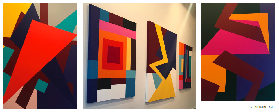
Compared to the first set of paintings, the shapes of the sub-collection Reconnection & Integration are meek and timid. Unlike the acrylic polygons, the colored paper cut-outs cluster at the center of their respective collages, engulfed in the white background. Rather than join along clean borderlines, white gaps peek out between cut-outs. They fit together almost perfectly, but not quite; there is frustration in the reassembly. “And I Can Change” introduces organic shapes and curves in turquoise and earthy green, welcoming life into the image. Reconnection is the process of revival.
Amid the chaos, four of the acrylic paintings seem outwardly orderly. The sub-collection Safety and Stability, is composed exclusively of right-angled polygons. But even these shapes do not depict a resolution. The long rectangles of “An Absence of Clarity” orbit around the center, coming together but refusing perfect alignment. At the core, concentric squares deepen in color, like a darkening tunnel with no visible outlet. “The Step Between” appears pixelated—an image in the making. Bars align vertically in “Stonewalling,” as their order imposes a new barrier. Each stage of recovery from trauma introduces new and unique challenges, and the journey is never steady.
“Synthesize” is the largest painting, and the plainest. A pale pink and orange frame surrounds a pale beige rectangle, bisected by a bright red bar, like a scar. The muted colors convey calmness, and the frame conveys unity, but the memory of the traumatic Remembrance & Mourning remains.