According to the Hirshhorn Gallery’s press release, Blinky Palermo was “long celebrated throughout Europe.” He is, however, an “artist’s artist” who has “escaped America’s notice.” That is perhaps why Blinky Palermo: Retrospective 1964-1977, running now in the Hirshhorn until May 15, is his first retrospective in the states, despite his many active years. That is to say, the Hirshhorn is sending up smoke signals of desperation, the kind that usually tip off even the art-inclined that an exhibit isn’t really worth your time. Which is a shame, because the usual clichés actually apply here: the little-known Palermo’s paintings and sculptures really do deserve more attention than they’ve gotten.
You’re hit with numerous reference points as soon as you peak the Hirshhorn’s first escalator. Palermo’s exhibit, receiving the museum’s highest billing, is prefaced with a summary that namedrops Malevich, Mondrian, Polke, Richter, Beuys. Indeed, Palermo does explore themes similar to those explored by these artists; his take on austere minimalism frequently takes on an expressionist bent unique to his German heritage. Even when lacking the roughness this implies, his use of shape and color is more in line with Malevich and Mondrian’s inviting geometry than minimalism’s cold asceticism.
His early works show this divide exclusively, which is why they seem the most derivative. Works like “Composition with 8 Red Rectangles” (1964) and “Blue Bridge” (1964-65) are smartly-composed exercises in form and hue, and heavily indebted to Malevich and Mondrian (with a hint of Franz Kline’s abstract expressionism). The keen eye for both composition and color shown here, however, predicts his impressive and far more daring future.
This future takes a divergent path, as Palermo explores skills and influences on two separate routes. The first of these is his distinctly German expressionism-cum-minimalism. “Untitled (Totem)” (1964-67) sees the artist exploring the Donald Judd-esque notion of painting versus sculpture. Instead of Judd’s cold, colored steel, however, the piece is constructed with paint and canvas wrapped around wood. The result has far more life than straight minimalism, but to no real end; it isn’t more compositionally interesting nor is it in any way emotionally stirring.
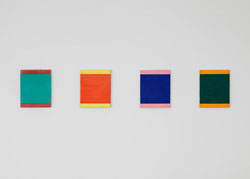
He better plays to his strengths on the second route: a crisp, fun approach to color and line that approximates a post-Color School Mondrian. The massive “To the People of New York City” (1976) shows this best, a delightful piece consisting of 24 painted rectangles of aluminum arranged wonderfully in the gallery. Exploring just three consistent hues—a deep black, fire-red, and smooth goldenrod – the pieces come off like modulations on an improvised idea, remarkably alive for their strict lines. At his best, as in this piece and the should-be classic “Blue Disk” and “Staff” (1968), this difficult mood is what Palermo achieves—however clichéd that may sound.