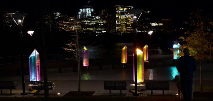
In its third year, the Georgetown GLOW art instillation adds a bright touch to the area, but it is more trendy than it is artistic. It follows in the footsteps of many other cities that have put on similar exhibits such as in Paris, Baltimore, and Santa Monica. While it is less spectacular than its counterparts, individual pieces stand out and provide an interesting context to Georgetown’s landscape.
In “Prismatica,” a work by the Toronto-based studio RAW Design, multicolored translucent prisms line the Georgetown waterfront and give spectators an opportunity to interact with the installation. Each of the 25 pieces spin around on its platform, providing an interesting complement to the ripples of the Potomac. There is a subtle contrast between the prisms and the view of Rosslyn across the river; the outlines of the skyscrapers slightly matching those of the art. However, the city sits dark in the background while the art stands out in its brightness. Although the exhibit is more fun than thought-provoking, the piece’s ability to provide entertainment definitely has its values.
One of the most striking and innovative works is “On the Wings of Freedom,” a series of origami butterflies that stand atop cables and are lit up in a variety of color patterns. It stands in stark contrast to the Grace Street Church, which lies directly behind it and provides a backdrop of solemnity to the hopeful butterflies. The work portrays a vivid image of freedom and escape with the lines of butterflies, while the multi-colored light display reflects an ability to change. This piece had the most depth out of all of the works, and stood on its own while maintaining its linkage to the rest of the exhibit.
The least cohesive and most disappointing part of the installation is “Teetering x Tottering (On the Brink),” two hastily-made teeter totters that are filled with water bottles, located next to Dean & DeLuca on M Street. Another piece that invites participation, its artistic value falters in the face of its entertainment value. The intended purpose of the piece is to display balance and take in the sounds of the rushing water from the bottles, but I got nothing out of it and felt that it did not fit in with the other works in GLOW.
When Santa Monica had a GLOW festival in 2013, one of the pieces was a large overhead neon netting that participants could walk through. The festival was held on the beach, and the instillation had a clear connection to the fishing industry that is such a large part of the community. It made the viewer a participant, giving the feeling of being trapped within the net, providing a walk-through experience that really made the person think. Most importantly, that piece was striking in its size and brilliance, a quality that all of the pieces at the Georgetown GLOW desperately lacked.
Overall, GLOW could have been much more impressive and spectacular considering that neon lighting is widely used in modern art. The pieces within the exhibit were neither cohesive nor individually appealing enough to justify a completely positive response. For an exhibit as renowned as GLOW, the displays should have been more spectacular and intriguing. Instead, the viewer can get the same effect of Georgetown GLOW by looking at Christmas light displays. The pieces feel store-bought, unoriginal and mostly incohesive. “Prismatica” is a good stop on the walk back from Farmers Fishers Bakers, but GLOW is not an exhibit that warrants the full tour.


