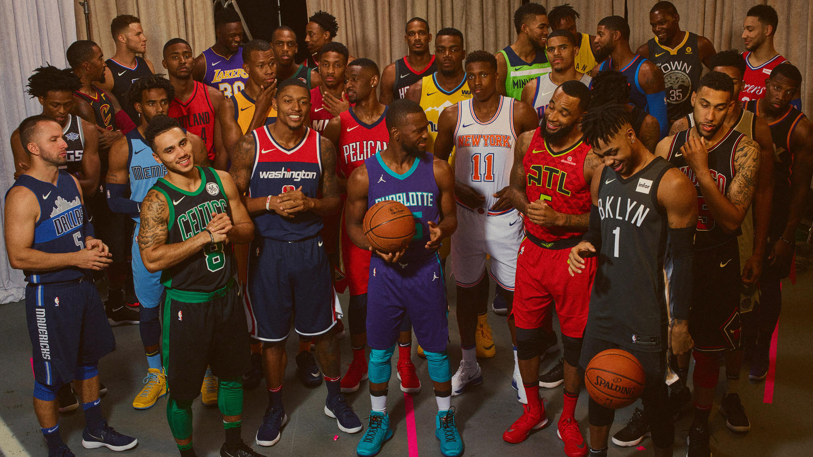
On Friday, Sept. 15, the NBA and Nike unveiled the alternate ‘Statement’ uniforms for all 30 teams. Naturally, I have subjectively ranked them based on personal aesthetic preferences. A photo gallery of the jerseys can be found here.
- Utah Jazz
If someone dumped an entire bottle of mustard on a clean white jersey, this is probably what it would look like. A hideous ‘gold’ color sets this jersey up for failure, and the oversized Jazz logo is oddly placed, resulting in far too much empty space on the jersey.
- San Antonio Spurs
The worst possible way to make a ‘statement’ is to make an entirely gray uniform. In all fairness, this is perfectly in line with the stoic attitude of Gregg Popovich and Kawhi Leonard. The Spurs logo is far too large and the player numbers are far too small, creating an awkward look.
- Minnesota Timberwolves
This is exactly what you might expect to see when you go to an AAU tournament, and that’s exactly where it should stay. Minnesota has done well with their recent rebranding, but this green is a major miss.
- Portland Trailblazers
The entire uniform is only red and black. There’s no third color to add any sort of depth or grab fans’ attention. If there were some other color behind the script or stripe, I would be a big fan of this look.
- Detroit Pistons
This jersey is simple and clean, but the gray color leaves a lot to be desired. Given some of the more colorful Pistons uniforms we have seen in the past, I would have liked to see a return to the glory days of Grant Hill.
- Atlanta Hawks
The entire rebranding of the Hawks resulted in an atrocious new color scheme and uniform combo. This uniform doesn’t help alleviate those problems in any way.
- Los Angeles Clippers
WHERE.IS.THE.POWDER.BLUE!? There were so many different directions Nike could have gone with the Clippers, but they chose black. It could be worse, but the uniform as a whole is a bit underwhelming for a team in one of the NBA’s largest markets.
- Phoenix Suns
If there was ever a time to bring back 1993, this was it. With this black uniform, we don’t get the Barkley-era uniforms that were arguably the greatest in NBA history. A swing and a miss for both Phoenix and Nike.
- Miami Heat
Miami didn’t mess with a good thing and it works out well. This is a nice uniform, but, unfortunately for the Heat, other teams were more adventurous with their Statement uniforms.
- Dallas Mavericks
It’s never easy to put a skyline on a uniform, but Dallas finds moderate success with it. For that, they get some bonus points. The rest of the uniform, however, is nothing to write home about.
- Brooklyn Nets
All black can work really well at times, but it’s also an unoriginal idea for a jersey. The Nets changed up the logo, opting for just “BKLYN” to appear on the front side. That nets them (ha) some credit but not enough to push them past other jerseys in the rankings.
- Oklahoma City Thunder
A franchise in dire need of a rebrand, the Thunder get points for switching up from their regular white/blue combination. However, their effort is a little too bland and doesn’t come off as memorable.
- Indiana Pacers
Similar to the Jazz, but a much better choice of color brings the Pacers uniform in at 18th. Still, just having a single color throughout with no pattern leaves a lot to be desired.
- Los Angeles Lakers
Laker purple and gold has been a fixture in the NBA for decades, so this iconic look definitely works. There’s a lot of potential left on the table for something adventurous or even more nostalgic like the Minneapolis blue colorway Kobe once rocked.
- Memphis Grizzlies
The Grizzlies are another team that falls in the category of not fixing something that isn’t broken. This uniform is essentially a replica of the old Adidas alternate that has become forever associated with rough, grit and grind basketball.
- Sacramento Kings
The introduction of some pattern always helps, unless it’s the Hawks uniform. Sacramento gets bonus points for not simply putting out a solid purple jersey.
- Washington Wizards
The Wizards didn’t really choose to do much with their Statement jersey design as it seems to be an almost exact replica of their existing jersey. However, the design itself is still solid and more creative than many other jerseys around the league.
- New Orleans Pelicans
The Pelicans don’t really do anything creative with their jersey designs most of the time. This is no exception, but it is still a clean look. If the team had gone for something more daring, it definitely would have ranked higher on the list.
- Orlando Magic
Who doesn’t love pinstripes? The Magic pretty much replicated their old alternate jersey with one small change, blue pinstripes instead of white. It’s an interesting choice; blue is definitely a more creative option than white on the black overlay. It’s a classic design that works with a little twist.
- Houston Rockets
All black with a little grey and red thrown in results in a basic but effective design. The placement of the red being on the shoulder region instead of the collar, reminiscent of the Rockets alternate jersey this past season, would have helped. A bolder highlight of red on the team name outline would have pushed this up the list.
- Denver Nuggets
Taking the skyline from the Mavericks and the vibrant yellow of the Pacers, the Nuggets have an eye catching uniform that will be a focus over the season. Unfortunately, the same can not be said for the team itself.
- Milwaukee Bucks
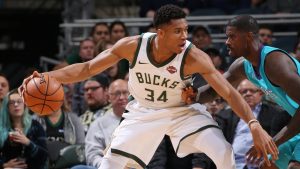
Ever since the Bucks decided to rebrand back in 2015, their uniforms have been solid. The Statement jersey is no exception, featuring the logo right on the front with stripes on the sides. The lack of any text on the front makes this a unique design.
- New York Knicks
Both modern and throwback influences seem to be featured on the Knicks’ Statement jersey. The Knicks have always had an iconic design, and it’s a shame we won’t get to see Melo rock this jersey next season.
- Boston Celtics
Not flashy, but a nice change of pace from the classic white and green that the Celtics have rocked for decades. The black and green complement each other well on this design.
- Chicago Bulls
While their season may be a tank job the likes of which has been unseen since Sam Hinkie was fired, the Bulls managed to put out a solid Statement jersey. The design is pretty much like the Celtics’ jersey except for the swapping of green for red.
- Toronto Raptors
The black and red design is reminiscent of the Bulls’ jersey, but the Raptors design packs a punch that Chicago’s just doesn’t seem to have. Again, it’s not the most original jersey, but it works well.
- Cleveland Cavaliers
The Cavs’ Statement jersey is essentially their black, sleeved jersey with the sleeves removed. The team also opted to put the logo in front as opposed to any text which works well given the color scheme. The color logo bounces off the red shoulder lines and number perfectly.
- Golden State Warriors
It’s a pretty simple design, but the Warriors found a way to include an actual reference to Oakland on the jersey. The Jack London Oak, which as a symbol itself looks great, is the perfect touch on a jersey with a nice color scheme to boot. The Warriors can’t seem to stop winning.
- Philadelphia 76ers
This jersey has a lot going right for it. The stars on the sides, the script font displayed on the front, and the colors all blend together to make a combination that pushed for first place.
- Charlotte Hornets
I love the Hornets color scheme. That’s probably why their jerseys ended up landing at the number 1 spot. The purple and blue seem to complement each other perfectly, a combination of colors that shouldn’t work but does so well.


