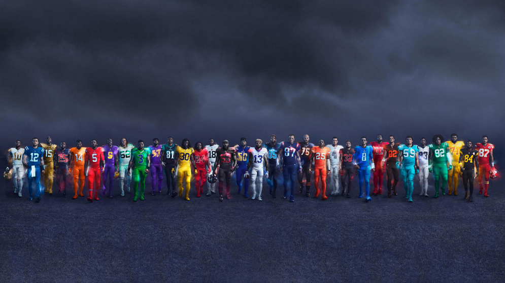
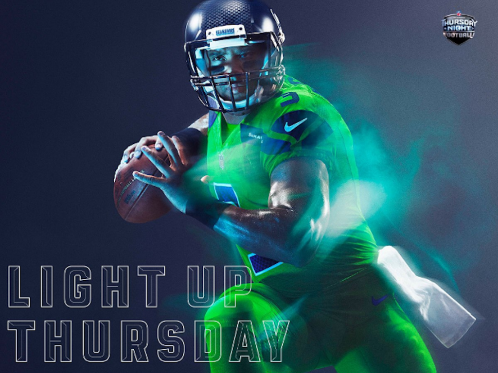
The designers of this season’s color rush jerseys did their homework. In case you’ve been living under a rock all season: monochrome is winning. But for the less educated, we’ll take a moment for a brief fashion timeout. What you need to know is that the MVP of the recent men’s fall ready-to-wear collections, a.k.a. monochrome, is the perfect blend between minimalism and drama; it’s a head-to-toe look in just one color. We’re talking peacock blue jumpsuits à la Alexander McQueen and punchy red overcoats as seen in Dior Homme. Vibrant monochromes in shades of wine-tone reds and kicky charcoals enliven style on and off the field.
To recap, the monochrome is not just in, it’s dominating. Powerful, fierce, bold, and committed, the monochrome look makes a statement. And when this fashion game plan is teamed with the NFL, the full force of the monochromatic trend kicks off. But not every team lives up to the trend’s potential; so here is our ranking of who got monochrome right, and who got it wrong.
Via Nike
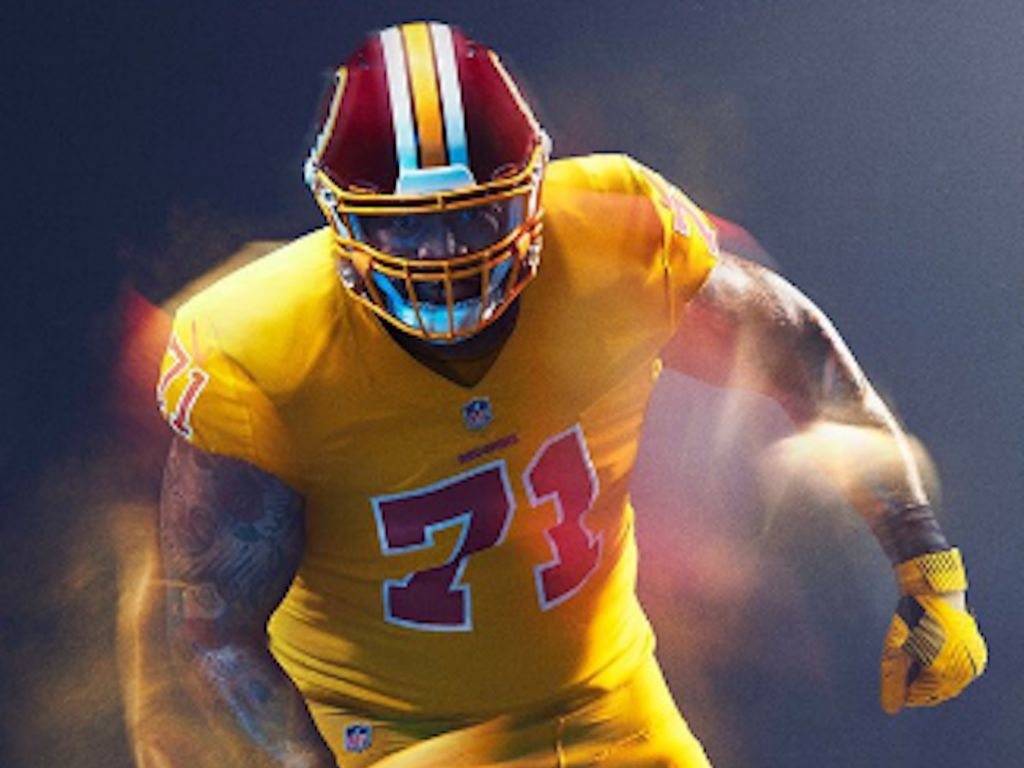
32. Redskins
Emma: One word: McDonald’s.
Alli: Now this team is racist and has an ugly uniform.
Via Nike
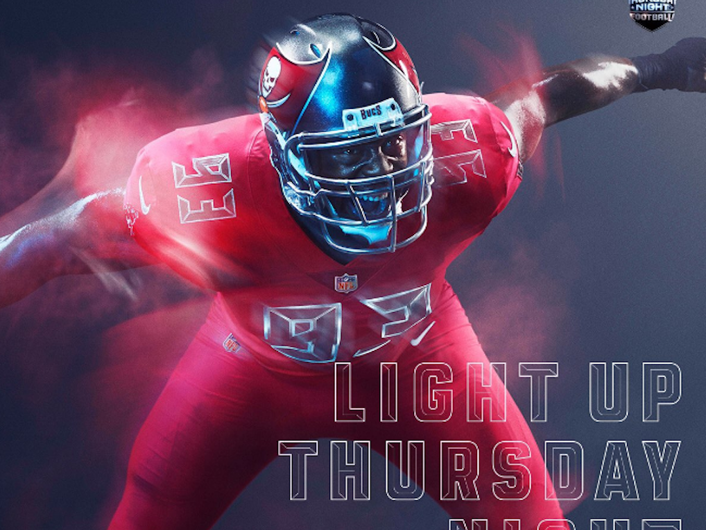
31. Buccaneers
A: No. There is nothing good about this uniform.
E: The deep red has a muddy undertone.
A: This is not as good as the Bills.
E: The number looks like Minecraft and it’s weird. There are a lot of different textures on this uniform that don’t go well together. There’s a brush stroke along the chest, matte numbering, and then just random ribbing along the thigh.
Via Nike
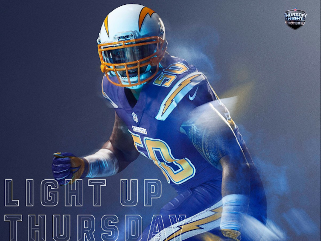
30. Chargers
A: Ew, no.
E: This is so tacky. It looks like a comic strip live action movie gone wrong.
A: What a specific take.
E: This is honestly so hideous. Why are there so many lightning bolts on this uniform?
A: All of the colors are awful. I want to stress again that this is so tacky.
Via Nike
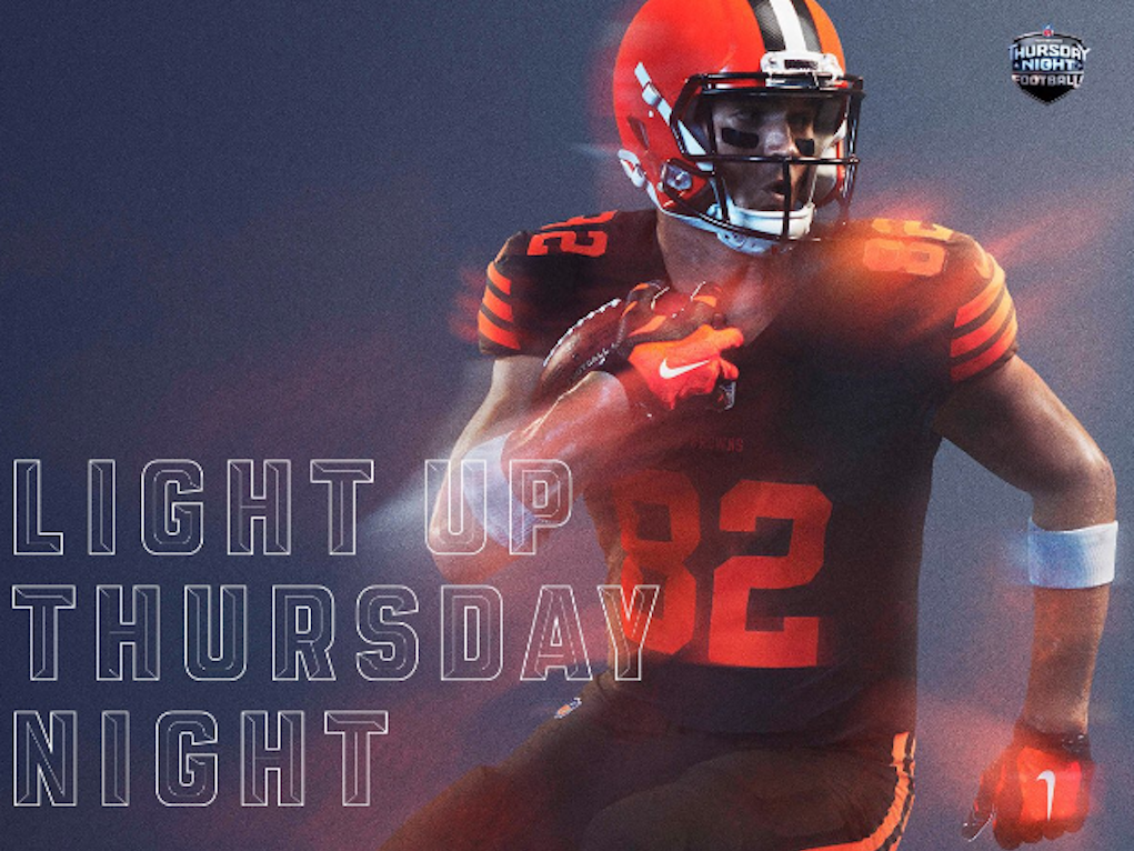
29. Browns
E: That’s a very fall palette.
A: I want to pick apples right now.
E: Can someone get me a pumpkin spiced latte? A successful color pairing features two colors that complement each other, each bringing out the best in the other. These two colors are way too similar, it just looks like a maple tree.
A: No one looks good in all brown. Period.
Via Nike
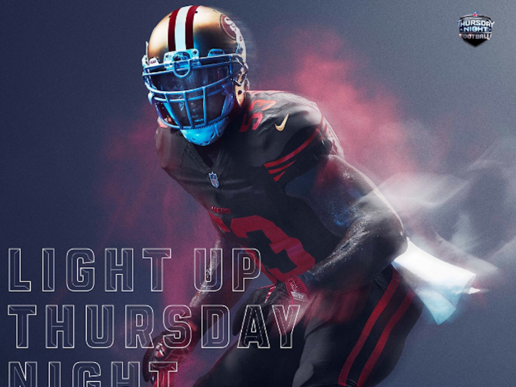
28. 49ers
E: Wow. I just had a déjà vu moment.
A: Yeah this is just a bad knockoff version of the Cardinals uniform.
E: The red disappears into the black.
A: No number outline.
E: Cool helmet, though.
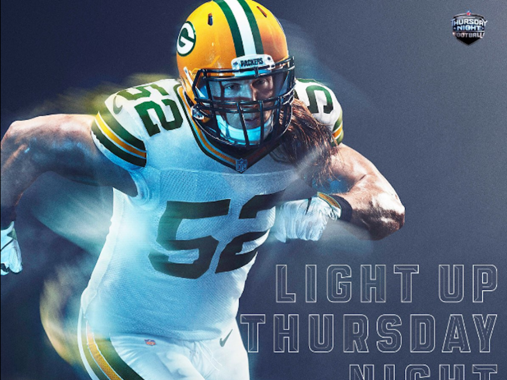
Via Nike
27. Packers
A: This doesn’t look color rush. It looks like a normal uniform.
E: But with a bulky font and an awkward stripe.
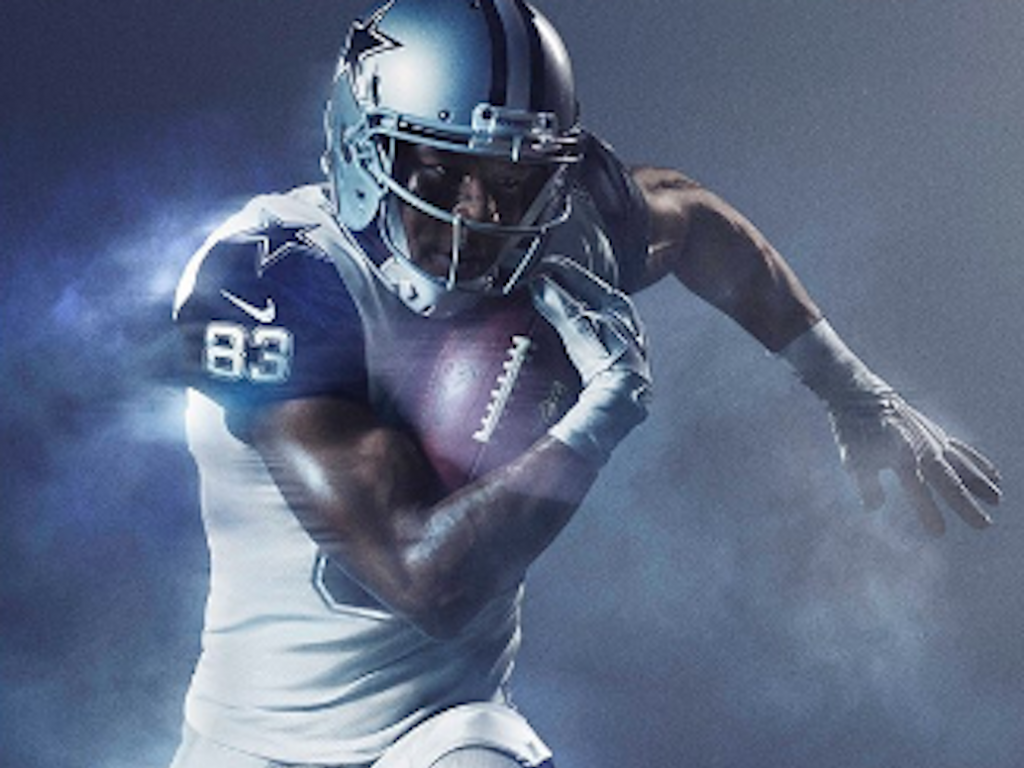
Via Nike
26. Cowboys
A: Fuck the Cowboys. But we like the stars.
E: The navy and white colorblocking on the shoulders is the best part about this uniform.
E: Having already seen a very successfully done white monochrome color rush uniform, this one just falls short.
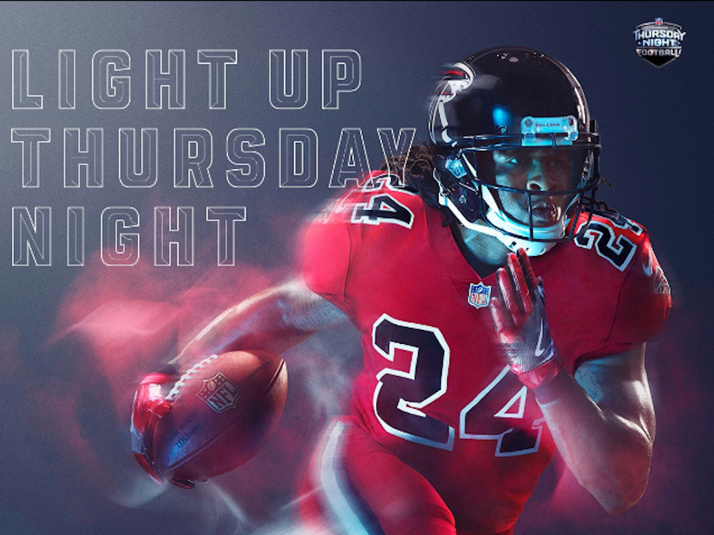
Via Nike
25. Falcons
E: That’s a good red. It’s fiery. Although at the end of the day it’s just another red uniform.
A: We have nothing left to say about this because no red uniform will be as good as the Bills’ red uniform. Everything else is a waste and we don’t want to see it.
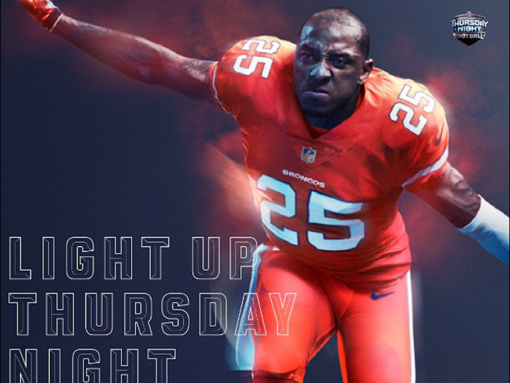
Via Nike
24. Broncos
A: It’s definitely color rush, but I don’t know if I like the color of the rush.
E: The font is nice and the outline of the numbers is nice and this is definitely a strong color that makes a strong uniform but something just seems a little off.
Via Nike
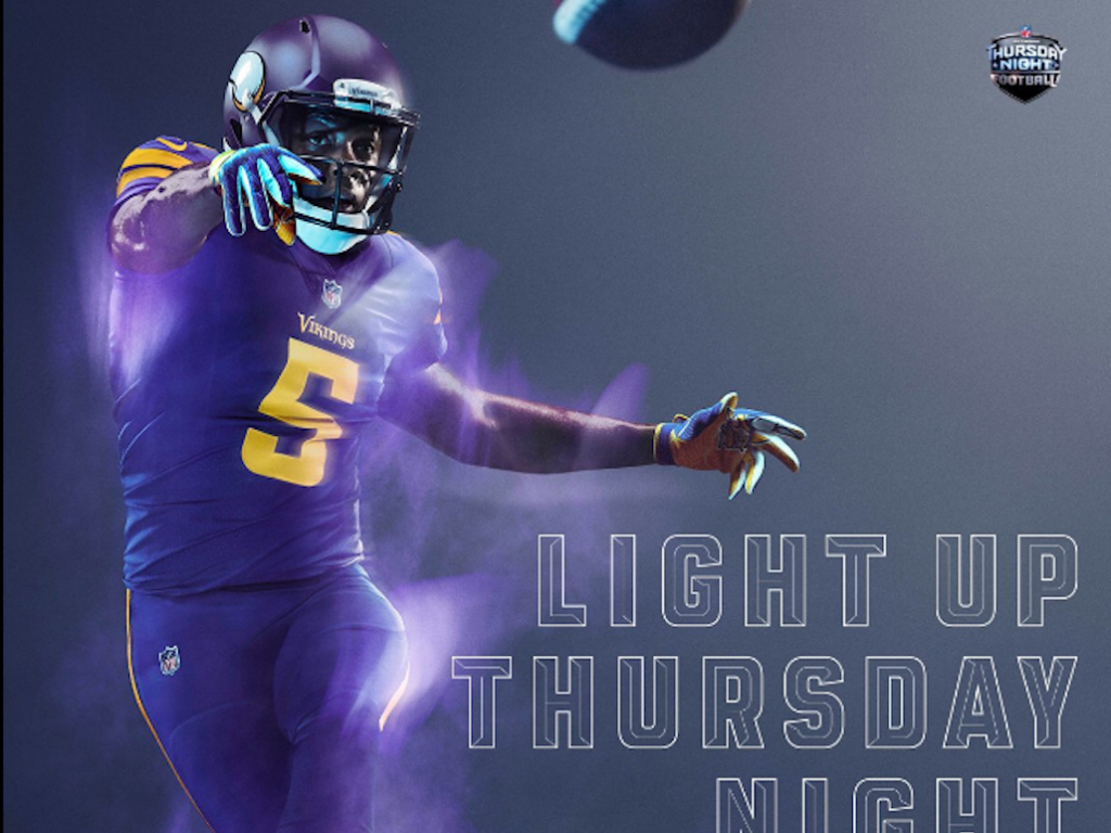
23. Vikings
E: It’s a very deep purple, but it comes off a little flat next to the yellow.
A: It would be really pretty if they played the Dolphins or the Seahawks.
E: The striping on this is ugly.
A: It doesn’t do any favors for his body shape. (This is ironic body shaming.)
Via Nike
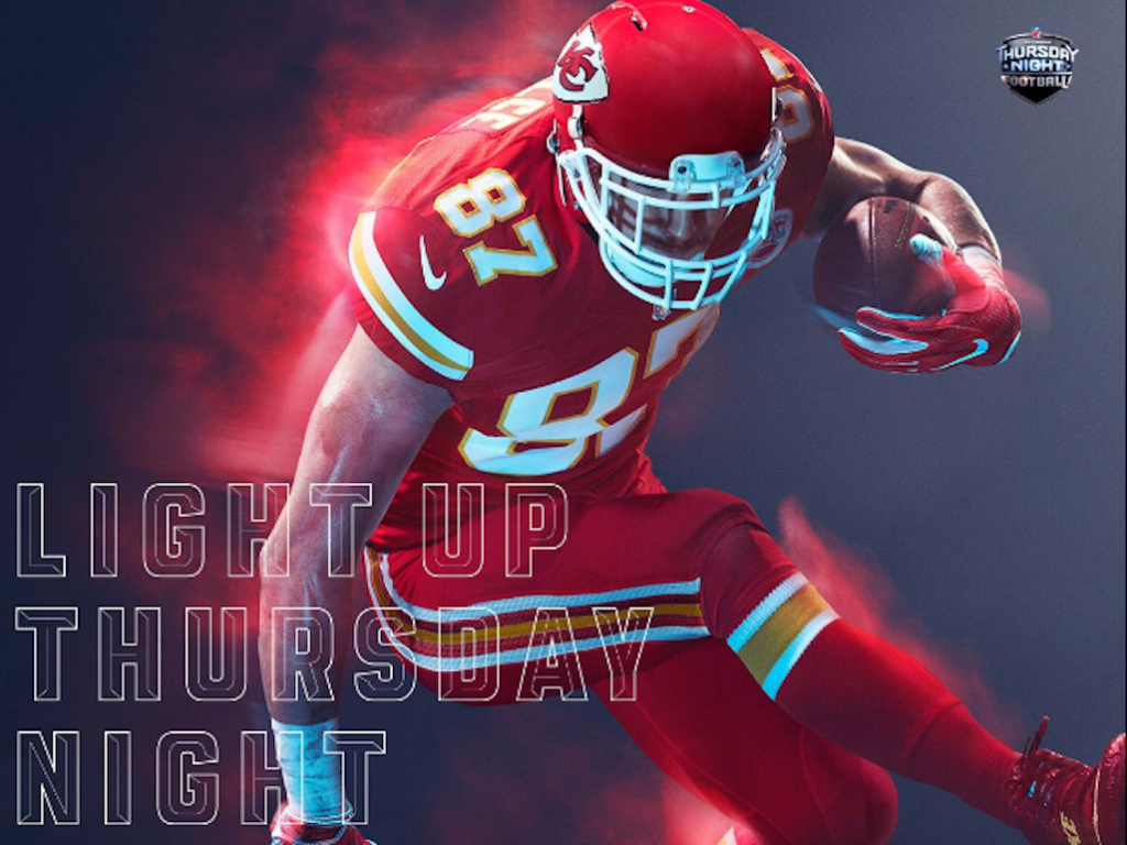
22. Chiefs
E: We like this red. It’s like clifford or a hot tamale.
A: Both are similar things.
A: The red has power it is strong and it is fierce and definitely in competition with the Bills’ red.
E: The gold accent is also nice.

Via Nike
21. Texans
A: If that’s navy, not black, then I dig it.
E: Samesies.
Via Nike
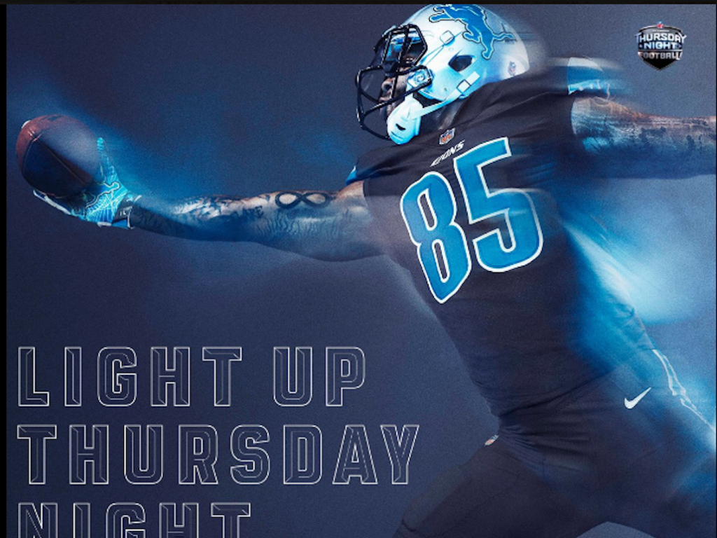
20. Lions
A: Such a Wintermint-y Blue. It really pops in contrast to the black.
E: Approachable but strong, I want to date that. Easy on the eyes.
A: There’s really not much else to this one.
E: Agreed.
Via Nike
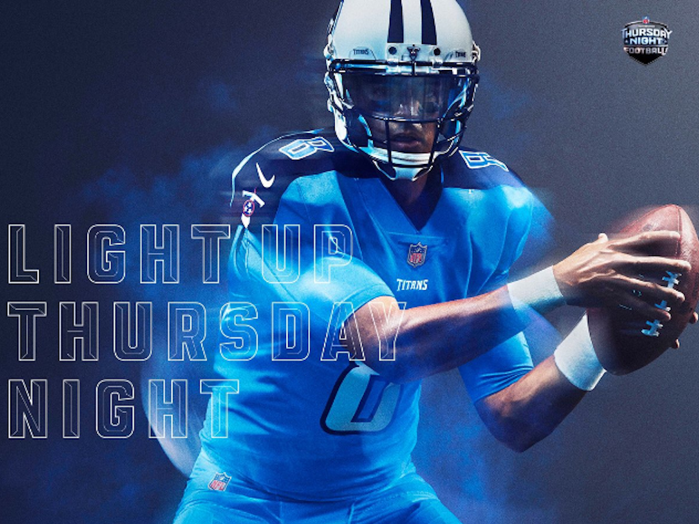
19. Titans
A: Okay, blue. Carolina Blue.
E: Is it Mayflower Blue or Cornflower Blue?? There’s cool patchwork on the navy accents.
A: Yeah, the navy striping creates a defined v-neck look that I thoroughly enjoy.
Via Nike
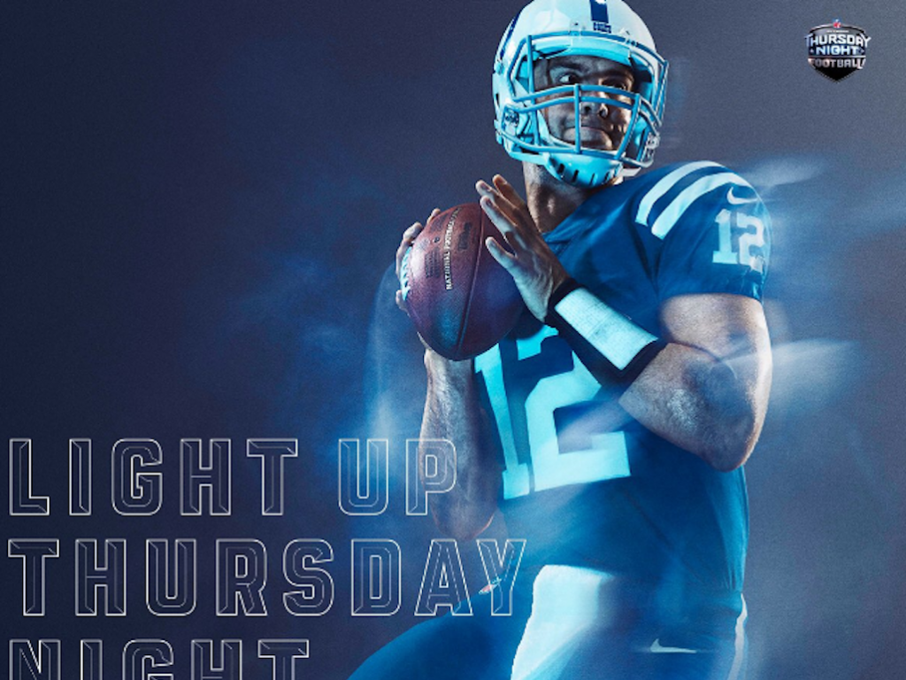
18. Colts
E: That blue is heavenly. The white really stands out, but not overtly so.
A: This is a classic uniform–it’s similar to the Patriots or Giants in that it’s timeless.
Via Nike
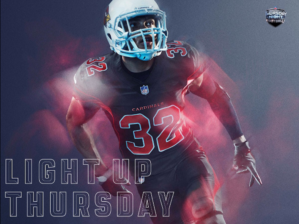
17. Cardinals
A: I like this.
E: The firetruck red pops. The red is classic, the font is classic and simple. And a huge plus, there’s no offensive striping!
Via Nike
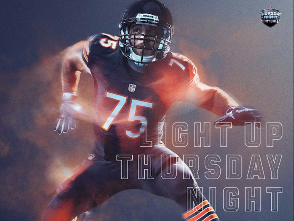
16. Bears
A: Personally, I love this font.
E: That’s a nice font. You know what it looks like?
A: IT LOOKS LIKE MODERN NO. 20 (a beautiful font).
E: Overall, very elementary, primary colors, simple, crisp font, traditional interpretation of contrasting colors.
Via Nike
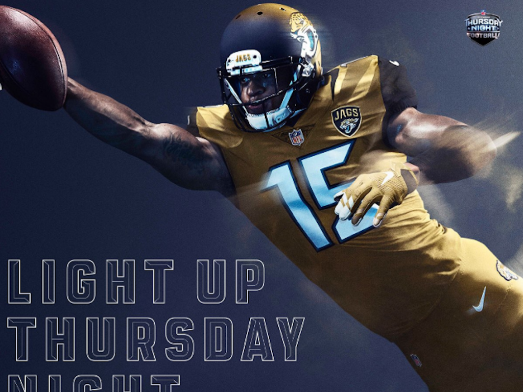
15. Jaguars
A: All gold should be a thing.
E: The color makes me want it to be sparkly.
A: But it’s not. So we’re disappointed.
E: I would wear those cleats with jeans and t shirt. And maybe a blazer.
Via Nike
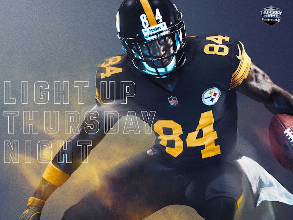
14. Steelers
E: Doesn’t it look like quidditch?
A: Welcome to Hufflepuff, Antonio Brown.
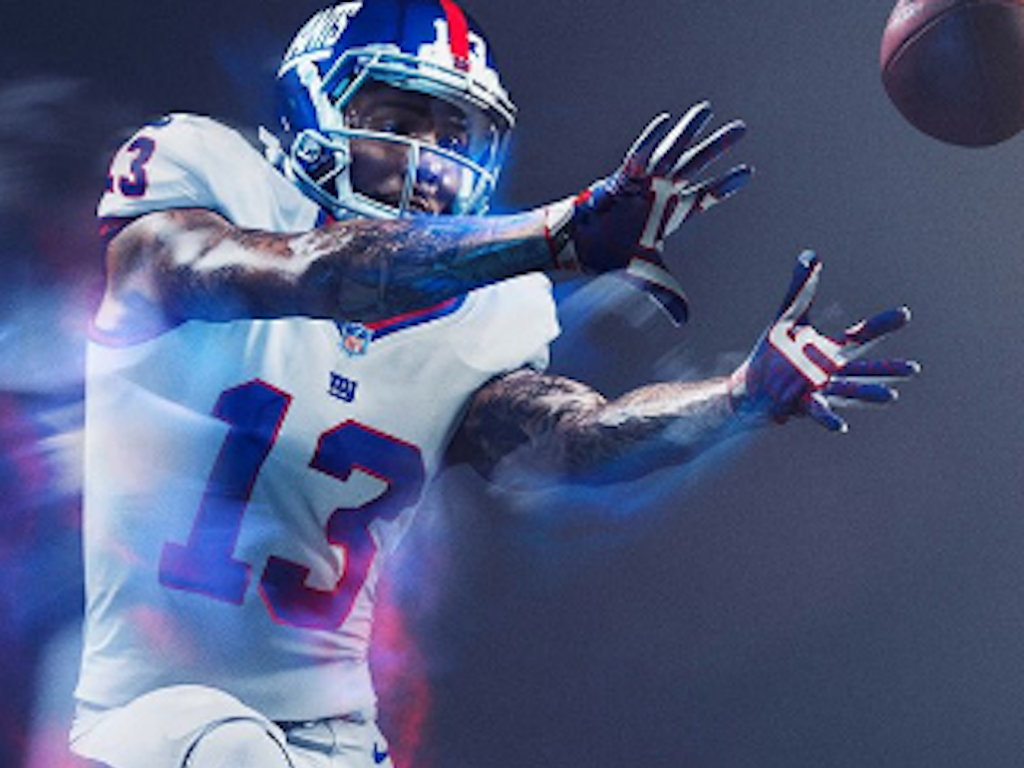
13. Giants
E: This says modern America. It says New York. It’s clean, sophisticated, minimal.
A: It’s understated but powerful and I love the red trim.
Via Nike
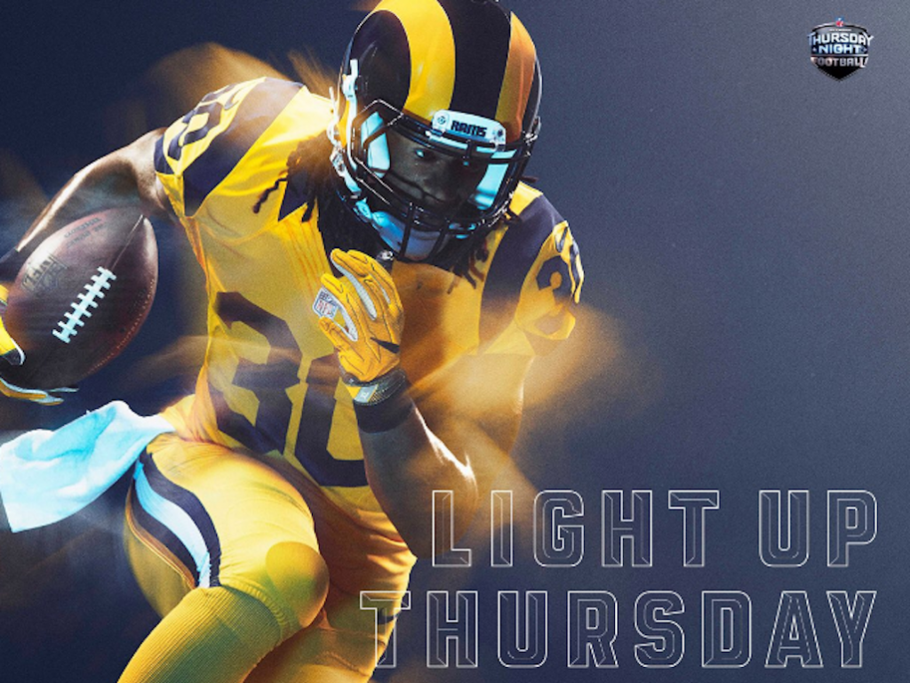
12. Rams
E: I really like this.
A: I really hate this. That is literally the golden snitch and there are mixed opinions on whether this is good or bad. This looks like a transformer.
E: Okay or a power ranger.
Via Nike
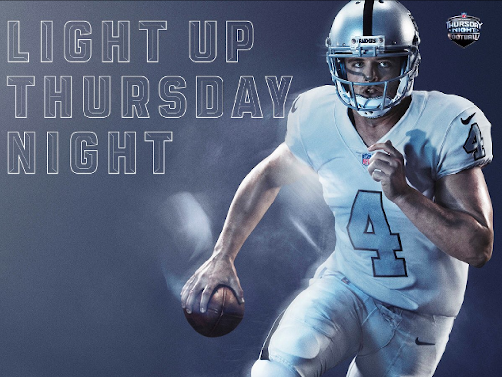
11. Raiders
E: Now this is a breath of fresh air.
A: At first you look at it think, “Wow, that’s nothing special.” But compared to how obnoxious some of the other uniform colors are, this is nice.
E: Also in this picture the helmet looks sparkly and we dig that.
Via Nike
10. Eagles
A: Let’s fucking go, birds.
E: It looks like an eagle.
A: Remember in the Hunger Games when Katniss spins in her dress and becomes a literal mockingbird? I get similar feelings about this uniform and an eagle. The black in this is super nice and the green is great.
E: As far as forest greens go, this one is a nice forest green. It’s definitely hard for a forest green to hold up against a black and this uniform does it well.
A: Congrats Eagles, this may be your only other win of the season.
Via Nike
9. Seahawks
E: This color is ~minty fresh~
A: It’s very tropical, very Florida Keys.
E: I love this a lot.
A: We want to watch this team play because of how much we like this color.
Via Nike
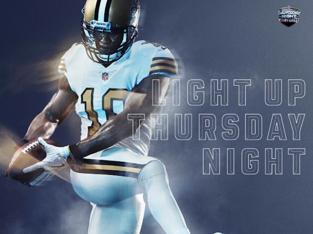
8. Saints
A: We like this.
E: It’s simple but it has a strong contrast and it’s clean. I want this as pajamas.
A: That gold is great. It makes me want to play football.
E: That’s when you know they STRUCK GOLD.
Via Nike
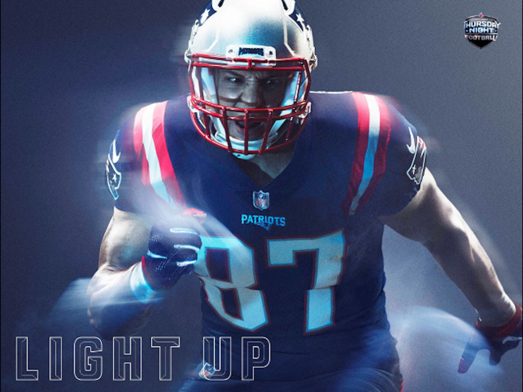
7. Patriots
A: That’s gorgeous.
E: It’s timeless.
A: These colors are great and they look even better on this uniform and this uniform will look even better on Tom Brady.
E: It’s very masculine but the way the red cuts around the shoulders is honestly just beautiful. It really accentuates the shape of this man.
Via Nike
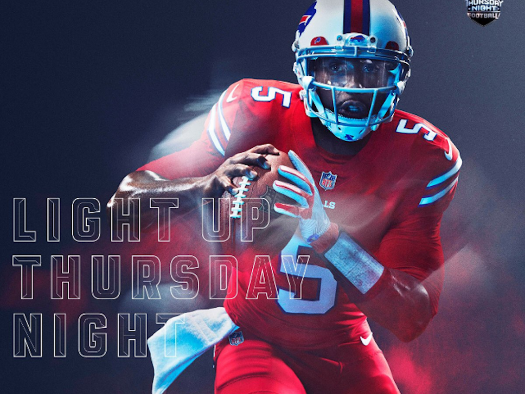
6. Bills
A: Oh, that’s RED.
E: Powerful.
A: It’s intimidating.
E: I’m equal parts intimidated and turned on.
Via Nike
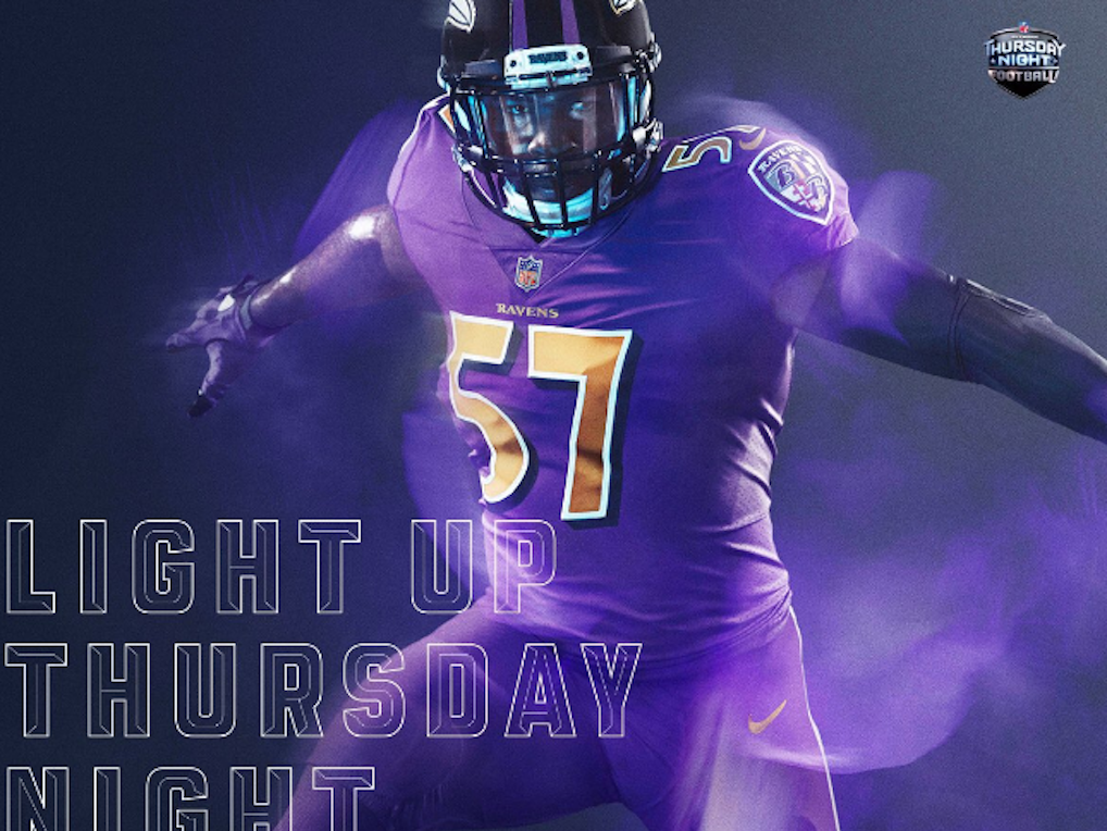
5. Ravens
A: This is a beautiful purple.
E: This is like a take-me-with-you purple.
A: What does that mean?
E: I would follow that purple around. If that purple told me to do something I would do it. What a rad shoulder patch.
A: The numbers are so clean. And the gold in the numbers looks like it has a nice texture.
E: The numbers have 90 degree angles.
A: We know we used a protractor.
Via Nike
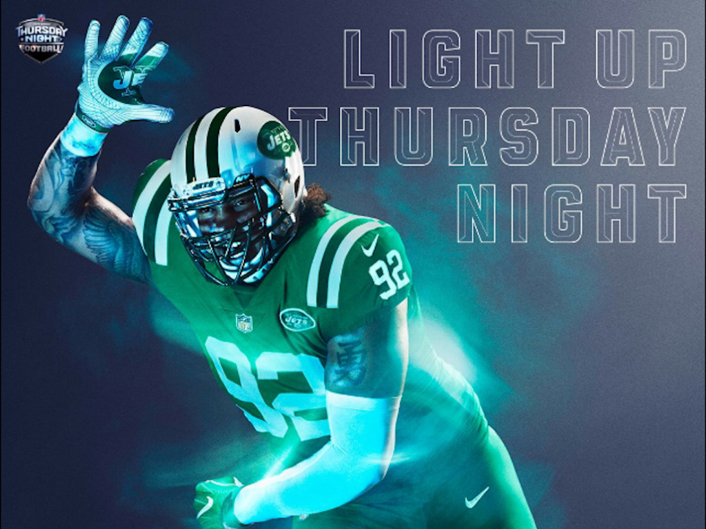
4. Jets
E: The Jets are green, that seems stupid.
A: Okay, this is the Hulk.
E: This just looks like a lizard. But, I love it.
Via Nike
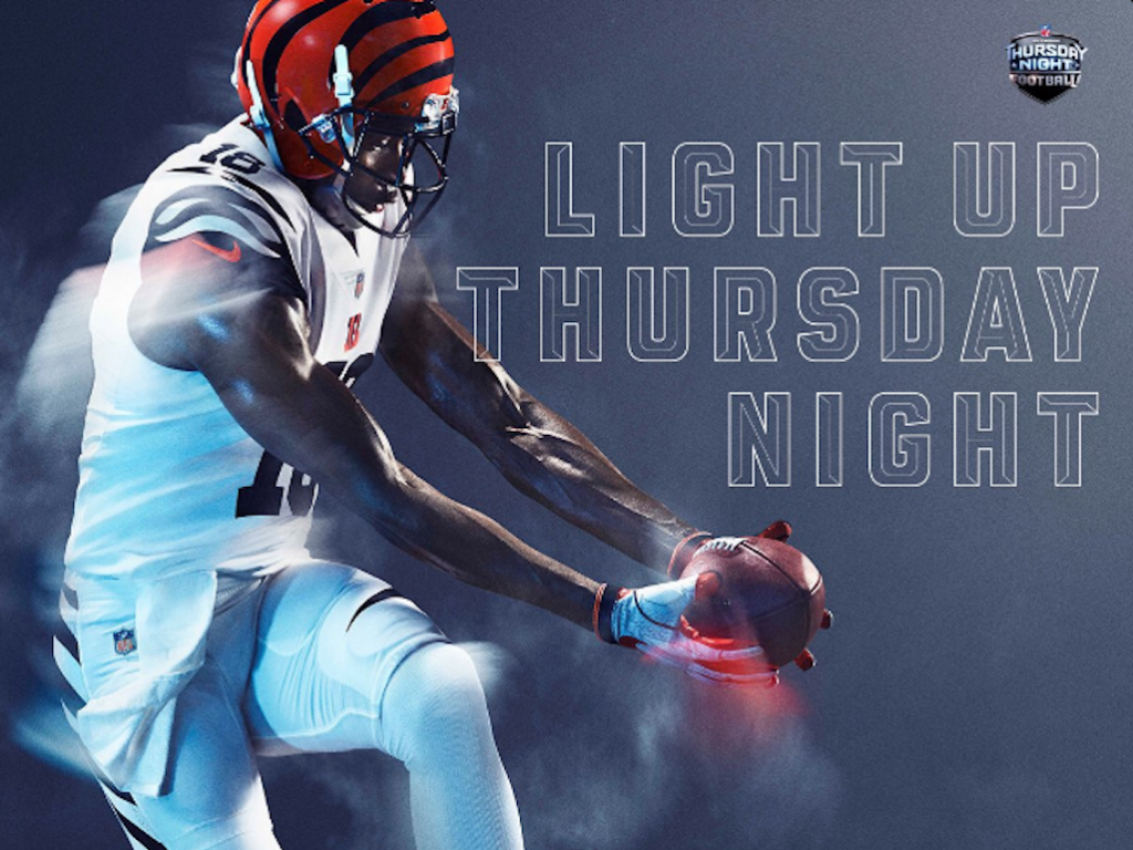
3. Bengals
E: That is fierce but playful.
A: This is a great example of a white color rush done right.
E: I like the juxtaposition between the helmet and the stripes on the shoulder.
A: The stripes down the leg are really sassy (but they would look even better as cut outs).
Via Nike
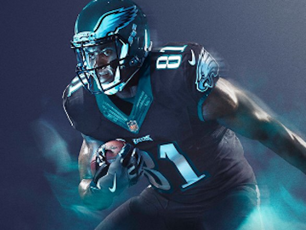
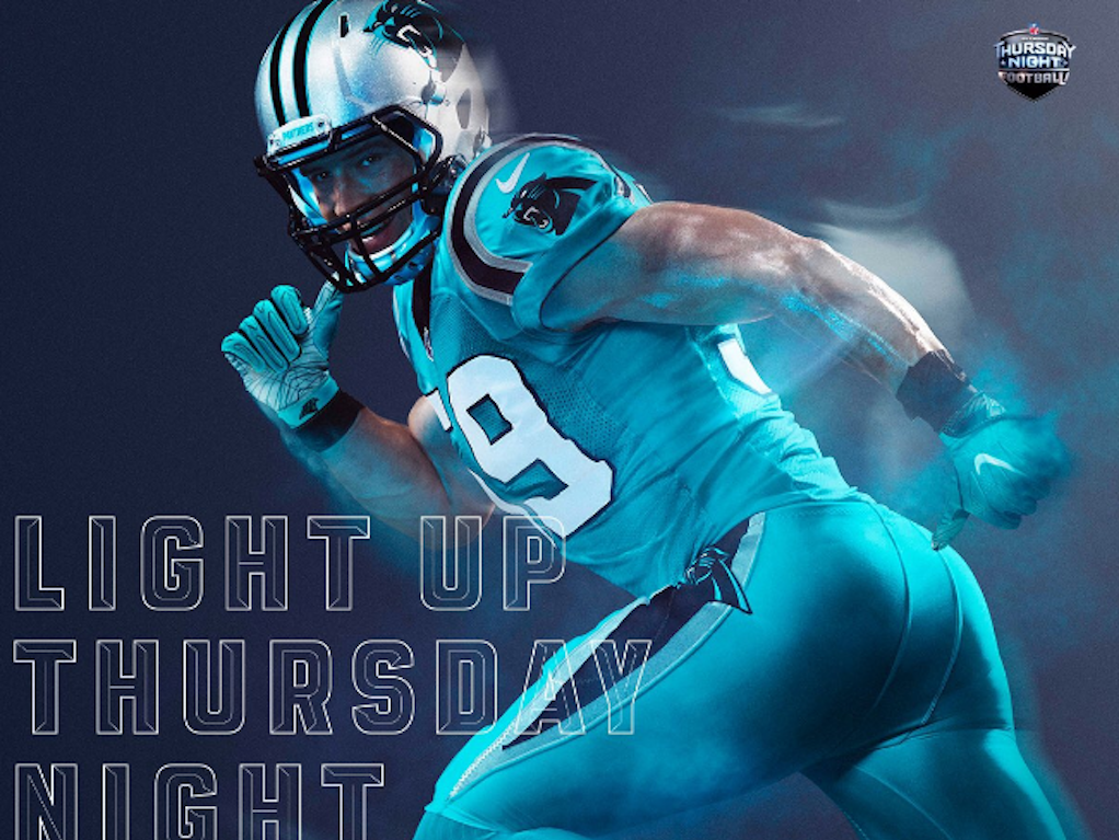
2. Panthers
A: This is a good color…but wait, what color is it?
E: Is it a standard icy teal?
A: We’ve been told that the Panther’s color is Columbia Blue and it does not look like that in this picture and if it truly was Columbia Blue this uniform would look much better. Instead, it looks metallic.
E: I can’t figure out what the color is to save my life.
A: WHAT IS THIS COLOR!?
E: We like the icy blue but we need to know what kind of icy blue this is: is it Elsa from Frozen? Tiffany blue? Robin’s egg??
A: Someone give us an answer!!
Via Nike
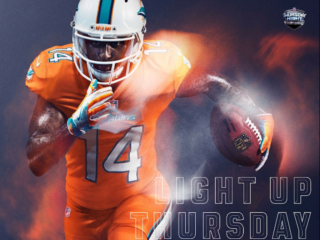
1. Dolphins
E: That color was pulled from a construction cone. It’s like tango mango.
A: I’m not at all intimidated by that; I want to sit and admire this with a creamsicle.
Overall, we love this new line of jerseys. It’s one big color stampede of monochrome. It’s big. It’s bold. It’s powerful. This rush of color might actually make us enjoy football (at least the sparkly helmets certainly will).