CW: Racism, violence.
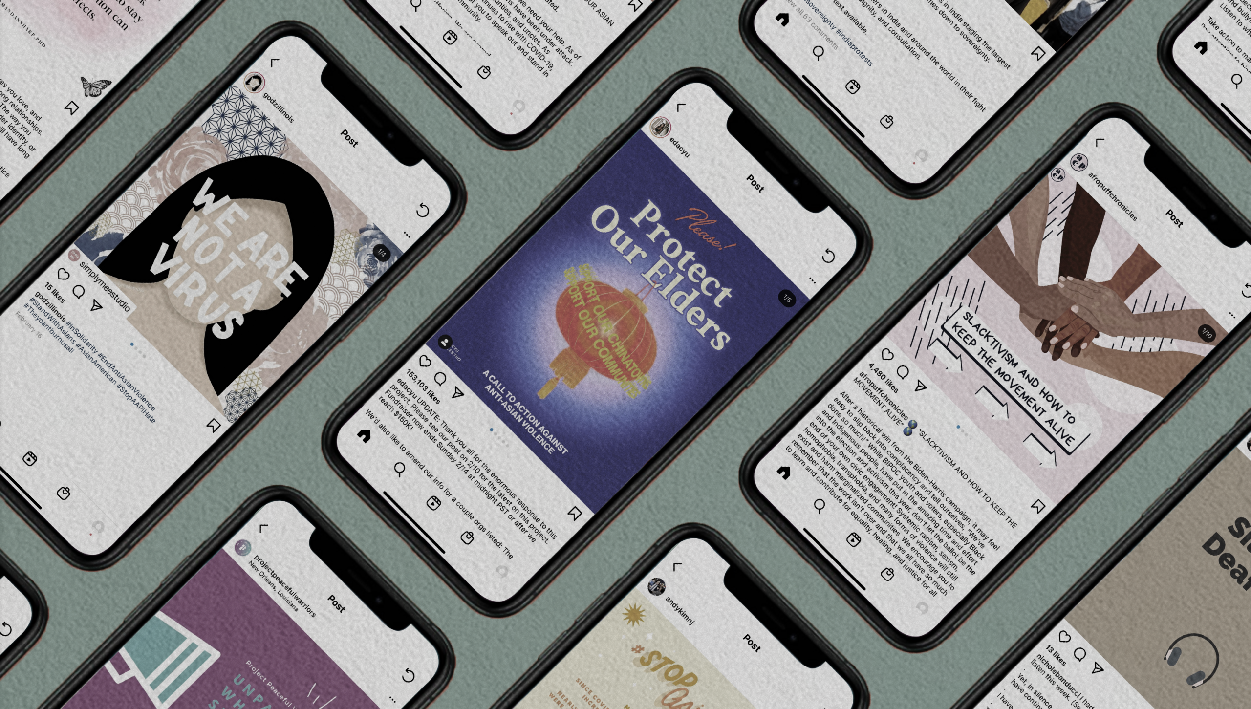
One late February morning, I was scrolling through Instagram when I saw an infographic about the increase in anti-Asian hate crimes in the U.S. The post—a series of dark blue slides with a Chinese lantern that read “Protect our Elders, Support our Communities”—made me pause.
It was not the content that surprised me, but its timing and form. Since the beginning of the pandemic in March 2020, both the media and the public have consistently failed to discuss this pattern of violence. But suddenly—a year later—this one post was being circulated around Georgetown students’ Instagram stories. The graphic urged people to “Speak up” and demonstrate solidarity with the Asian community. But rather than feeling supported, I felt frustrated.
As an Asian American from the Bay Area, I’ve witnessed the increase in anti-Asian sentiment firsthand. Many of the reported incidents occurred in my hometown and the surrounding areas. These instances of discrimination are not just distant stories. They are part of my experience: scathing remarks to “go back to China” out of car windows, disgusted looks at my grandparents in the store, and snide comments from walkers on the neighborhood trail. It was frustrating, then, to watch months of blatant racism get reduced to five colorful slides that self-imagined “advocates” scrolled through, reposted (only the first slide, though—that’s the “cute” one), and forgot.
My angry reaction may have been prompted by this post, but it reflects my broader feelings about social media infographics. These five-to-ten slide posts typically combine information about social justice issues with colorful backgrounds and artwork, and are uploaded to platforms like Facebook, Instagram, or Twitter.
Social media is, first and foremost, a tool for community building; it’s a space where people share their lives, meet one another, and exchange ideas. After the heightened dialogue around the Black Lives Matter movement this summer, it is increasingly being utilized as a place to share resources about systemic racism, violence, and other social injustices. These posts, which often take the form of infographics, can spark important discussions. Slides with clear evidence and actionable next steps make social justice issues accessible to the public. Still, I feel conflicted about how social media users tend to deploy infographics—particularly on Instagram.
With their trendy, minimalist design, infographics aestheticize injustices. Many frequently-shared posts are bright, colorful, and could arguably be described as “cute.” I appreciate artists’ roles in social movements and value pieces with cultural commentary. Powerful artwork can help pay respects, create unifying symbols for a protest, or evoke emotions that motivate change. Yet, the dissonance between an infographic’s Canva-template aesthetic and its heavy content is uncomfortable. Seeing doodles of a cute Asian grandmother raising two middle fingers in a post about the physical beating of elderly Asian people is hardly empowering. These flippant presentations of trauma belittle and invalidate my experiences.
We must also consider why users circulate some infographics more than others. More often than not, it is the most “aesthetically pleasing” graphics that make the rounds on young people’s Instagram stories—the ones with pastel-colored backgrounds, rounded text, and artsy sketches. Our gravitation towards the same “beautiful” posts may successfully amplify a few messages. But when we care more about an infographic’s aesthetic than its content, we risk overlooking important issues that have not been packaged in the same way. For example: Though protests over farm bills in India have been going on since November, I’ve only seen a handful of people share infographics about it. The posts are quite informative, but they depart from the common aesthetic among popular infographics. I can’t help but wonder if these differences prevent them from being shared altogether. How many important issues do we ignore because someone has not made them pretty enough?
Another issue with infographics is their length. Fundamentally, they are short—Instagram has a 10-slide limit—but they bear ambitious titles like “How to Be an Ally” or “Unpacking White Supremacy Culture in Education.” The data in these posts is meant to startle the audience, and it often contains important pieces of information. Still, I struggle to think that such nuanced issues can be captured in a few text boxes. Somehow, though, reading through a post creates an artificial sense of “wokeness” that seems to absolve people from future action. Infographics have never been intended as a substitute for social justice inquiry. Yet it is easy to treat them as such, and I myself am guilty of this; I’ve flicked through a post or two and then parroted various statistics at my parents during dinner. But when I’ve been asked for more information and been unable to provide it, I’m forced to admit that, no, I don’t actually know where it came from. And yes, I do need to read more. Instagram infographics are punchy and digestible, but they’re not enough to understand the nuances of an issue.
Even more importantly, these posts suffer from the same problems of misinformation and disinformation that affect all social media. I recently saw an infographic stating that after March, anti-Asian attacks rose by 1900 percent in America. In reality, the post misquoted an NYPD report that highlighted a 1900 percent increase in anti-Asian hate crimes in New York City alone last year. I don’t raise this example to diminish the severity of anti-Asian violence, but to demonstrate the flaws in our overreliance on infographics. The graphic’s mistake might seem small, but it matters because it means that the post is wrong. Misinformation can be dangerous, and we need to be more conscious about the resources that we consume. Unfortunately, though some posts encourage independent research, many people’s reading begins and ends on the app.
In the digital age, infographics have become a quicker, flashier, and more beautiful method of virtue signaling. Online, people urge each other to post resource after resource, claiming that “silence is deafening.” This criticism makes sense to some degree; it takes seconds to put something on your story, and posts can display support for a cause or community. But when I see the same infographic over and over again, I wonder what it is really accomplishing. When someone shares a post, there is no guarantee that they’ve read its contents. There is no promise of research, follow-up, or future action. And though some graphics contain links to petitions or fundraisers, many users can (and do) repost the slides without contributing to external initiatives—even if they have the means to do so.
This performative nature is underscored by the fact that most people only repost graphics to their Instagram stories. If we claim that these social causes are worth constantly fighting for, why do we choose to display them for a mere 24 hours? Why don’t we post them to our regular feeds? Given the constant rhetoric about “keeping movements alive,” the fact that cutesy infographics literally disappear at the end of the day is ironic, reducing social justice topics to simple trends that cycle between weeks.
Some people might argue that, even if posting is performative, it is warranted because it disseminates information. I am wary of this perspective. At its best, performative activism is unproductive, but at its worst, it can be actively damaging. Consider the millions of people who posted a black square this summer with the caption “#blm.” While the action was intended to display “solidarity” with the Black Lives Matter movement, it ultimately clogged communication channels, inhibiting protesters from seeing messages about demonstration safety and police presence. Infographics do not always create these same immediate and negative consequences, but I am critical of the tacit acceptance of performative activism.
I don’t intend to blame the lack of structural changes on Instagram infographic posters. Part of the problem lies in the fact that we are limited in our capacity to address systemic issues. We live in a world controlled by corporations and elite institutions, and this power imbalance constrains the impact of our individual decisions. Understandably, this is anxiety-inducing; it is difficult to acknowledge both violence and our roles in it, but be unable to stop it. Perhaps, then, infographics are a way to assuage ourselves—to feel like we are doing something.
There are no easy answers to a lot of these questions, and I do not claim to be a paragon of activism on social media or in real life. Have I reposted an infographic and not donated to all of the links? Yes. Have I always done background research on the infographics that I’ve shared? No. Critical introspection isn’t easy, but social media users need to recognize self-gratifying cycles of internet activism and consider how it upholds the same systems that their cute graphics condemn. This does not mean that Instagram infographics should go away (in fact, I doubt they will), but that we should acknowledge their limitations and be sparing and intentional with their use. Maybe in doing so, we can create space for tactics that cause more impactful change.
When reposting an infographic, we must ask ourselves: What actually happens once I share this? It’s worth noting that—only a week after I saw the first posts about anti-Asian violence—discussion about the issue disappeared until this last week.
The recent media coverage of the Atlanta shooting has translated into a new infographic campaign, displaying acute racial trauma in Instagram stories. As I see pastel posts about the murder of Asian women proclaiming “hate is a virus,” I feel the same sense of conflict and frustration that I did in February. I appreciate this new level of public awareness, but it should not take a shooting to care about anti-Asian racism, nor was this an isolated instance of violence. I feel bitter because these posts will most likely be a short-term substitute for self-reflection and action.
The Asian community is scared and hurting right now. I implore you to consider whether your infographic will bring tangible change.


